The Dashboard Overview page provides a fully customizable, widget-based view of your app’s key performance data. Rather than a single fixed layout, the Overview tab now lets you build a personalized dashboard using a headline KPI strip and a library of drag-and-drop widgets covering Campaign & Creative performance, Trends & Reach, and Events & Engagement. Widgets can be added, removed, resized, reordered, and refreshed independently, and full layouts can be saved for future use.
- Log in to Kochava.
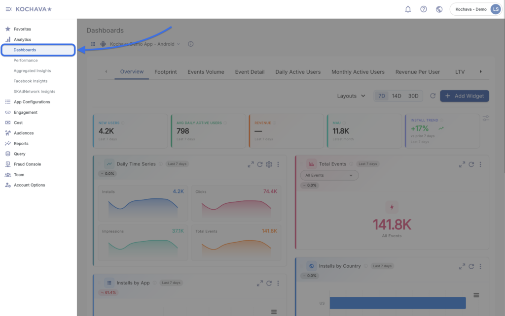
- Select the desired Account and App.
- Select Analytics > Dashboard > Overview.
Dashboard Toolbar
Along the top of the Dashboard Overview page, the following controls are available:
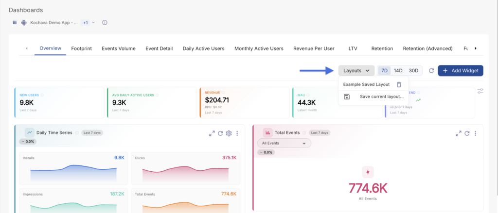
- Layouts: Save your current widget arrangement as a named layout, or switch between previously saved layouts. This allows different team members or use cases to maintain their own dashboard configurations.
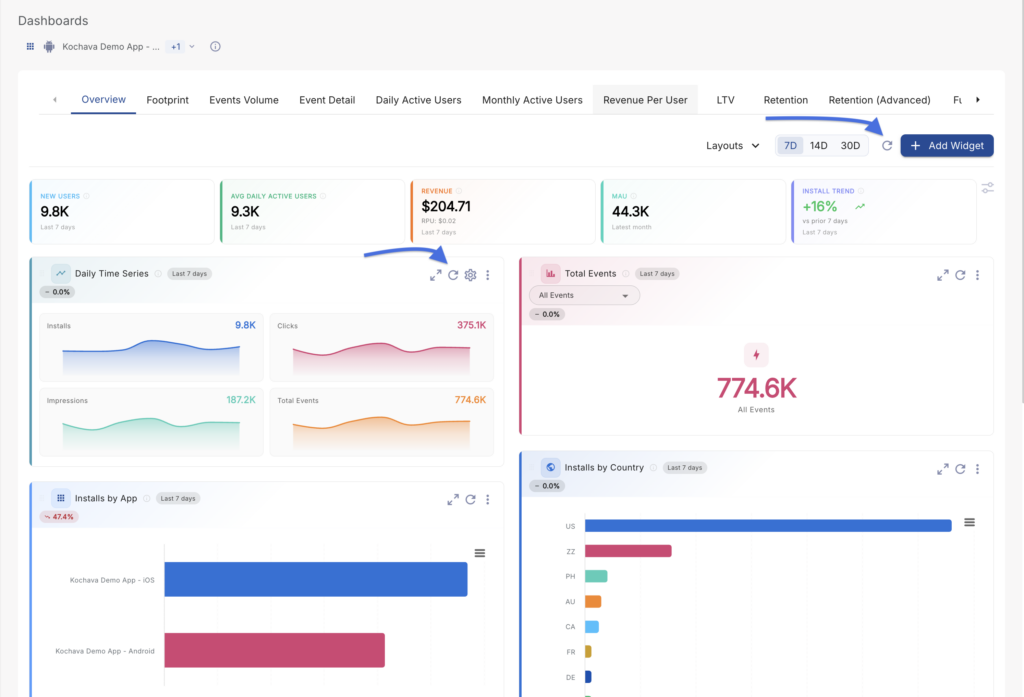
- Quick Date Range (7D / 14D / 30D): Instantly applies a 7-day, 14-day, or 30-day date range across the headline KPI strip and default widget views. 7D is selected by default.
- Refresh All (refresh icon): Refreshes the data for every widget currently on the dashboard in a single action.
- Add Widget: Opens the Widget Catalog side panel, allowing you to add new widgets to your dashboard. See Adding and Removing Widgets below.
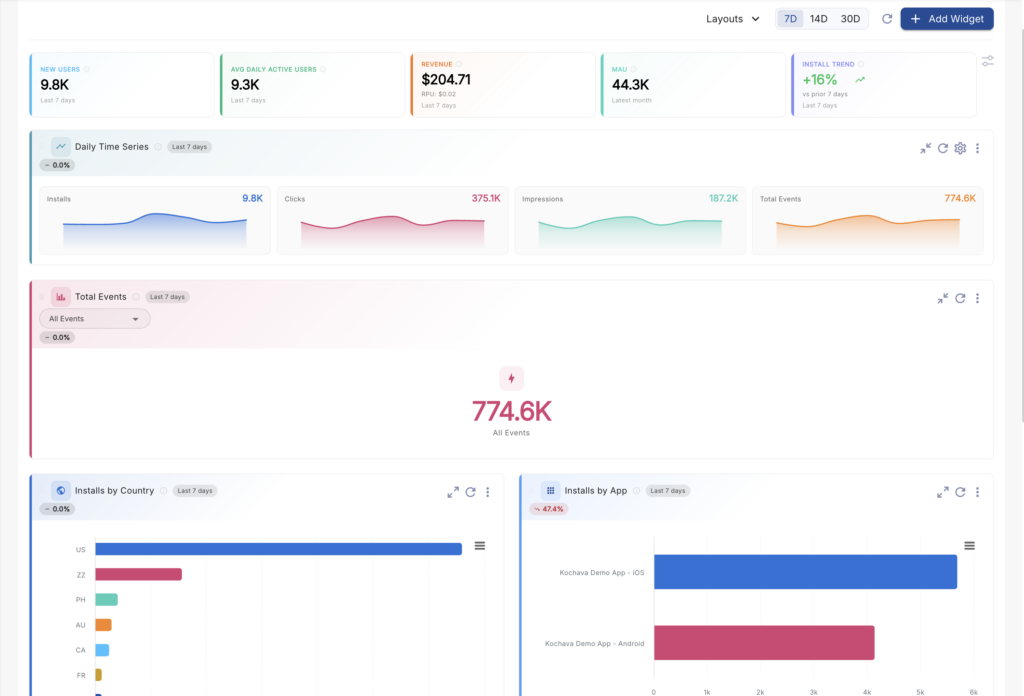
Headline KPI Strip
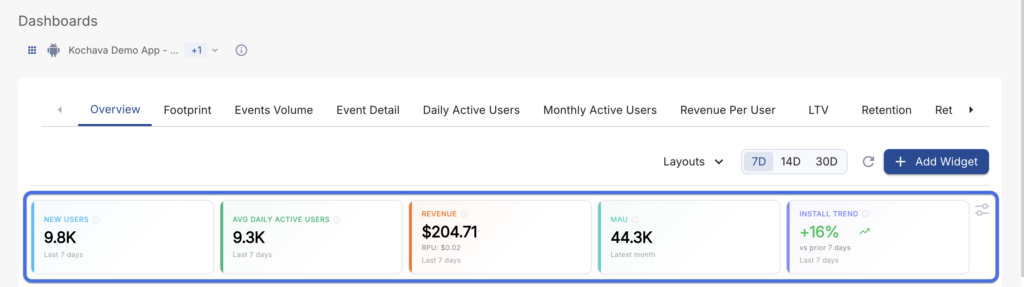
At the top of the dashboard, a row of color-coded Key Performance Indicator (KPI) tiles provides an at-a-glance summary of app performance for the selected date range. By default, the following five KPIs are displayed:
- New Users: The number of users who installed the app during the selected date range.
- Avg Daily Active Users: The average number of distinct users who performed an event on any given day within the selected date range.
- Revenue: Total revenue attributed to the app within the selected date range.
- MAU: Monthly Active Users — the count of distinct users who performed an event within the latest month.
- Install Trend: Displays a trend arrow and percentage change comparing installs in the current period to the prior period of equal length.
Each KPI tile includes an info icon (ⓘ) that displays a short description of the metric when hovered.
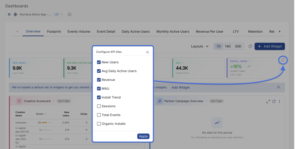
Configuring KPI Tiles
Click the Configure icon (tune/sliders icon) at the right end of the KPI strip to open the Configure KPI Tiles panel. From here, you can check or uncheck which metrics appear in the headline strip. In addition to the five default KPIs, the following optional metrics are available:
- Sessions
- Total Events
- Organic Installs
Once your selections are made, click Apply to update the headline strip.
The Widget Grid
Below the headline KPI strip, the widget grid displays your active widgets. Widgets can be freely rearranged, resized, and configured to build the dashboard view that best fits your workflow.
Widget Header Controls
Every widget includes a consistent header with the following elements:
- Drag Handle (⠿): Click and drag from the widget header to reorder widgets within the grid.
- Widget Icon & Title: Identifies the widget type (e.g., Creative Scorecard, Daily Time Series).
- Info Icon (ⓘ): Hover to view a description of what the widget displays and how its data is calculated.
- Date Range Chip: Displays the date range currently applied to that widget (e.g., “Last 7 days”).
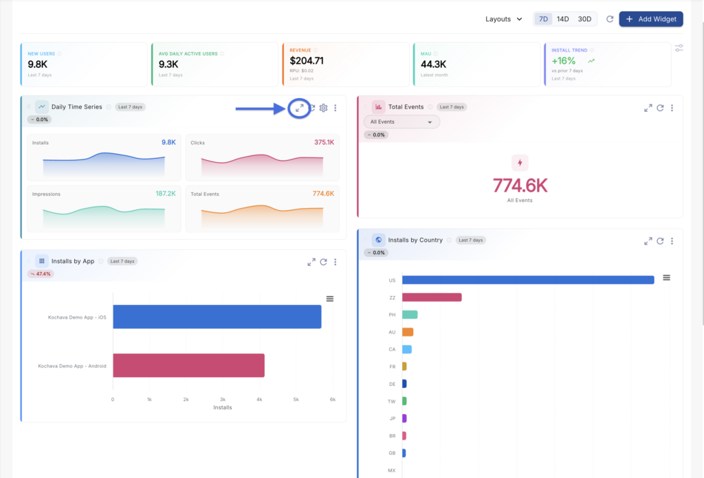
- Expand / Collapse: Click the expand icon to widen a widget to full dashboard width for a more detailed view. Once expanded, the icon changes to a collapse icon to return the widget to its standard size.
- Refresh: Refreshes the data for that individual widget only.
- Configure (gear icon): Available on select widgets (such as Daily Time Series), allowing further customization of the widget’s displayed metrics.
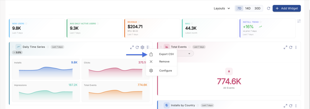
- ⋮ (More Options) Menu: Click the vertical dots icon to reveal additional actions:
- Export CSV: Downloads the widget’s underlying data as a CSV file.
- Remove: Removes the widget from your dashboard. (It can be added back at any time via the Add Widget catalog.)
Adding and Removing Widgets
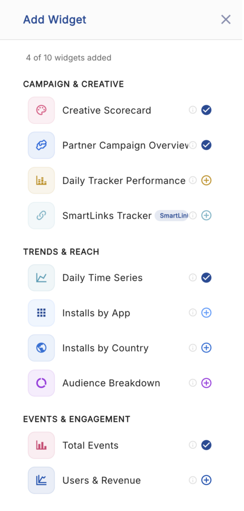
Click the Add Widget button in the dashboard toolbar to open the Widget Catalog panel. The catalog is organized into three categories: Campaign & Creative, Trends & Reach, and Events & Engagement. Each widget in the catalog displays its name, category, and a short description of the data it provides.
To add a widget to your dashboard, click the widget’s card in the catalog. The widget will be appended to your active dashboard grid, where it can then be repositioned, resized, and configured like any other widget.
To remove a widget, open its ⋮ menu and select Remove. Removed widgets are not deleted permanently — they remain available in the Widget Catalog and can be re-added at any time.
Available Widgets
The following widgets are currently available in the Widget Catalog, grouped by category:
Campaign & Creative
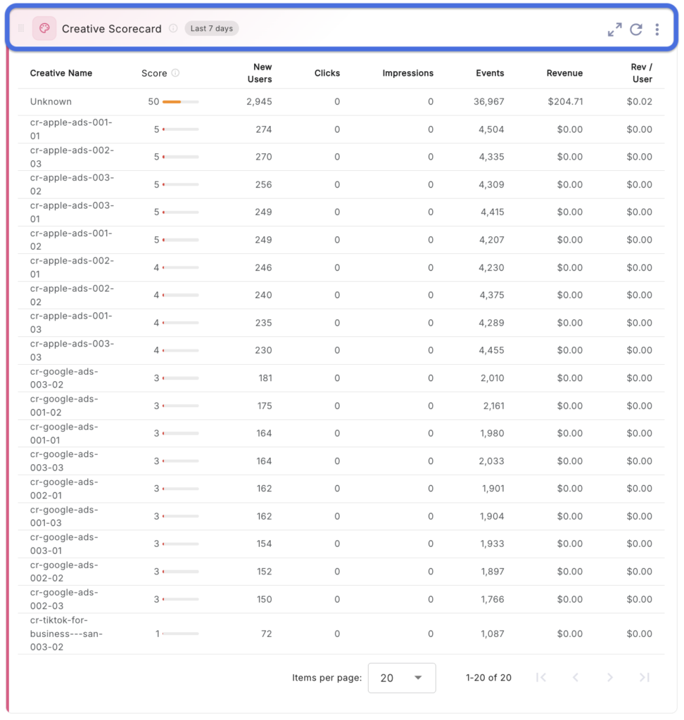
- Creative Scorecard: Ranks top-performing creatives based on a composite performance score driven by new users, clicks, and impressions.
- Partner Campaign Overview: Summarizes campaign-level performance broken out by media partner.
- Daily Tracker Performance: Displays day-over-day performance metrics for your active trackers.
- SmartLinks Tracker: Surfaces performance data specific to SmartLinks-based trackers.
Trends & Reach
- Daily Time Series: An interactive line chart plotting metrics such as Users, Events, and Revenue over the selected date range, day by day.
- Installs by App: Breaks down install volume across the apps included in the current App Name filter (useful with Cross App functionality).
- Installs by Country: Displays the geographic distribution of installs by country.
- Audience Breakdown: Segments users by attributes such as device type, device version, and OS version.
Events & Engagement
- Total Events: Displays overall event volume, including Per User and Total event counts, for the selected date range.
- Users & Revenue: Combines user activity (New and Total Users) with revenue metrics (Per User and Total) in a single widget view.
Expanding Widgets
By default, widgets are displayed at a standard grid size, positioned alongside other widgets. Click the Expand icon in a widget’s header to temporarily widen it to the full width of the dashboard for a more detailed view of its data. Once expanded, the icon changes to a Collapse icon, which can be clicked to return the widget to its original size and position in the grid.
Downloading Widget Data
The data displayed within any widget can be downloaded directly from that widget’s header:
Click the ⋮ (More Options) icon on the widget > Select Export CSV.
The exported file will reflect the data currently displayed in the widget, including any date range or configuration selections applied to that specific widget.
Refreshing Data
Data on the Dashboard Overview page can be refreshed at two levels:
- Refresh All: Located in the dashboard toolbar, this refreshes the data for every widget and the headline KPI strip at once.
- Individual Widget Refresh: Located in each widget’s header, this refreshes only that widget’s data without affecting the rest of the dashboard.
Saving and Switching Layouts
Once you’ve customized your dashboard — adding, removing, resizing, and rearranging widgets, and configuring your headline KPI tiles — you can save that configuration as a named layout for future use.
Click Layouts in the dashboard toolbar > Select Save current layout… > Enter a name for the layout > Save.
Saved layouts appear in the Layouts dropdown, allowing you to switch between different dashboard configurations at any time — for example, maintaining a separate layout for campaign performance review versus general app health monitoring.