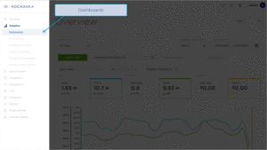
The Analytics Explorer page provides a detailed breakdown of any dimension and metric within the selected app. The Explorer page is fully customizable and provides the ability to include, exclude and reorganize data to maximize efficiency.
Analytics User Interface
- Log in to Kochava.
- Select the desired Account and App.
- Select Analytics > Dashboard > Explorer.
Analytics Page Tools
For more information about the tools that can be used on the Analytics page such as date range, filters, sharing the page and exporting device ID, refer to our Analytics Page Tools support documentation.
Filters:
Filters can be used to further refine, organize and visualize the displayed data in a method that is most beneficial. Multiple filters can be added and saved for later use.
- Click + Add Filter.
Added filters may be inclusive or exclusive. Select from the following filters categories:- App — Based on the available apps within account.
- Events — Based on Standard or Custom events.
- Location — Based on IP address.
- Attribution — Based on attributed installs and campaign attribution settings.
- Campaign — Based on campaign naming conventions.
- Device — Based on user agent.
- Traffic Verification — Based on Traffic success or failure.
- Agency — Based on the available apps within the agency account.
Once the filter category has been selected, one or more values may be added per filter. Filters can be saved and reapplied within any of the Analytics pages.
- Select the Filter drop-down menu, Select desired Filter.
- Add desired values.
- Click “X” to remove Filter.
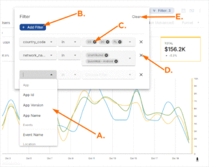
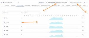
A. Filters
B. Click “+ Add Filter” to add metric
C. Click “X” to remove metric
D. Click “X” to remove Filter and associated Metric(s)
E. Click “Clear” to remove all Filters.
Date Range:
The date range filter provides the option to refine the window of data that is displayed. The following range types and time ranges are available for selection:
- Last:
- last day
- last week
- last month
- last quarter
- last year
- Previous:
- previous calendar week
- precious calendar month
- previous calendar year
- Custom:
- Start (Inclusive):
- Relative Date/Time — This option provides a text field in which a number can be manually entered and a drop-down box where the following options:
- Days Before
- Seconds Before
- Minutes Before
- Hours Before
- Weeks Before
- Months Before
- Quarters Before
- Years Before
- Specific Date/Time — A manual date/time may be entered or the calendar and time selection tool may be used.
- Now — This is the selection of the current date and time.
- Midnight — This is the selection of the current date and the time selection of midnight or (24:00hrs).
- Relative Date/Time — This option provides a text field in which a number can be manually entered and a drop-down box where the following options:
- End (Exclusive):
- Specific Date/Time — A manual date/time may be entered or the calendar and time selection tool may be used.
- Relative Date/Time — This option provides a text field in which a number can be manually entered and a drop-down box where the following options:
- Days After
- Seconds After
- Minutes After
- Hours After
- Weeks After
- Months After
- Quarters After
- Years After
- Now — This is the selection of the current date and time.
- Midnight — This is the selection of the current date and the time selection of midnight or (24:00hrs).
- Start (Inclusive):
- Advanced:
- Start (Inclusive) — Manually enter today or a specific desired start date.
- End (Exclusive) — Manually enter today or a specific desired end date.
- Previous:
- previous calendar week
- previous calendar month
- previous calendar year
- No filter:
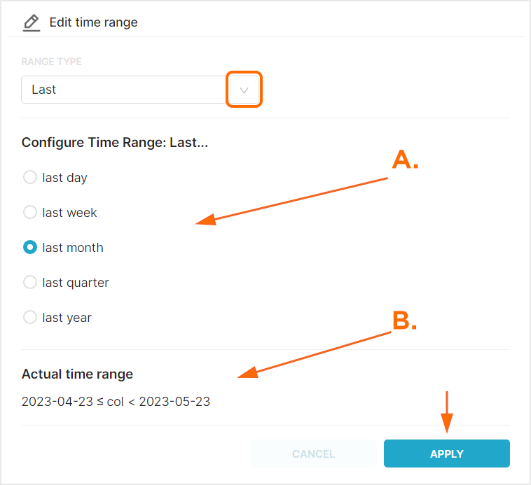
A. After range selection, select the desired time range.
B. Time range that will be displayed.
Cohorts:
Within Kochava, Cohorts are groups of users that installed an app within a specific date range.
- From the Cohort drop-down menu, Select one of the following:
- All Time — Displays all Event and all Install data for the selected date range.
- All Installs — Displays all Installs data within cohort date range.
- Attributed Installs — Displays only Attributed Installs within cohort date range.
- Unattributed Installs — Displays on Unattributed Installs within cohort date range.
When a Cohort is selected, the Cohort date field will be presented. Data for users who fall within the Cohort during the Cohort date range will be visualized within the defined Analytics date range.
A. Cohort Date Range: This date range determines the group of users to display within the Analytics Date Range
B. Analytics Date Range: This date range determines the overall length of time displayed
C. Data displaying the selected Cohort within the Analytics Date Range
Currency:
By default cost data is displayed in US Dollars, however cost data may be displayed in a variety of other currency.
From the Currency drop-down menu select one of the following:
- AED
- AFN
- ALL
- AMD
- ANG
- AOA
- ARS
- AUD
- AWG
- AZN
- BAM
- BBD
- BDT
- BGN
- BHD
- BIF
- BMD
- BND
- BOB
- BRL
- BSD
- BTC
- BTN
- BWP
- BYN
- BYR
- BZD
- CAD
- CDF
- CHF
- CLF
- CLP
- CNH
- CNY
- COP
- CRC
- CUC
- CUP
- CVE
- CZK
- DJF
- DKK
- DOP
- DZD
- EEK
- EGP
- ERN
- ETB
- EUR
- FJD
- FKP
- GBP
- GEL
- GGP
- GHS
- GIP
- GMD
- GNF
- GTQ
- GYD
- HKD
- HNL
- HRK
- HTG
- HUF
- IDR
- ILS
- IMP
- INR
- IQD
- IRR
- ISK
- JEP
- JMD
- JOD
- JPY
- KES
- KGS
- KHR
- KMF
- KPW
- KRW
- KWD
- KYD
- KZT
- LAK
- LBP
- LKR
- LRD
- LSL
- LYD
- MAD
- MDL
- MGA
- MKD
- MMK
- MNT
- MOP
- MRU
- MVR
- MWK
- MXN
- MYR
- MZN
- NAD
- NGN
- NIO
- NOK
- NPR
- NZD
- OMR
- PAB
- PEN
- PGK
- PHP
- PKR
- PLN
- PYG
- QAR
- RON
- RSD
- RUB
- RWF
- SAR
- SBD
- SCR
- SDG
- SEK
- SGD
- SHP
- SLL
- SOS
- SRD
- SSP
- STD
- STN
- SVC
- SYP
- SZL
- THB
- TJS
- TMT
- TND
- TOP
- TRY
- TTD
- TWD
- TZS
- UAH
- UGX
- USD
- UYU
- UZS
- VES
- VND
- VUV
- WST
- XAF
- XAG
- XAU
- XCD
- XDR
- XOF
- XPD
- XPF
- XPT
- YER
- ZAR
- ZMW
- ZWL
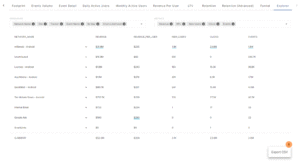
Explorer Chart Overview
The Explorer chart is divided into 2 main sections, the Dimensions and Metrics selection areas, and the interactive chart.
Dimensions and Metrics can be added, removed and reordered as needed.
Mousing over Dimensions displays the expand button. By clicking on the Dimension expand button, specific level data can be displayed.
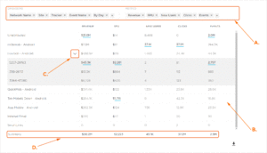
A. Dimensions and Metrics can be updated and organized as needed
B. Chart displaying selected Dimensions and Metrics
C. Dimension expand button.
D. Summary values are a sum of each row in the Metrics column. The only exception(s) to this are the RPU and RPI Metrics in which Kochava takes an average of the column.
Explorer Organization
Explorer data can be organized in many different ways in order to assist in the optimization of data visualization.
- Within the Dimensions section, Click the “+” icon and Select one of the following:
- Agency Name
- App ID
- App Name
- App Version
- Campaign
- Creative
- Segment
- Tracker
- Device Carrier Name
- Device Language
- Device Network Conn Type
- Device Orientation
- Device Os
- Device Os Version
- Device Type
- Device Version
- Ad Size
- Ad Type
- Churn Liklihood
- Churn Score
- Currency
- Friends Invited
- Items in Cart
- Mtr Rejected
- Data
- Device Type
- Placement
- Product Brand
- Product Name
- Product Sku
- Product Style
- Push Campaign
- Push Segment
- Receipt Status
- Revenue
- Session Duration
- Subscription Action
- Sum
- Total Sessions
- User Id
- User Total Revenue To Date
- Event Name
- City
- Country
- DMA
- Region
- Zip
- Type
- Install Campaign
- Install Creative
- Install Matched By
- Install Network Name
- Install Site
- Install Tracker
- Matched To
- Matched By
- Network Name
- Network Id
- Network Key
- Partner Ad Group Id
- Partner Ad Group Name
- Partner Campaign Id
- Partner Campaign Name
- Partner Keyword
- Partner Platform
- QR Code
- Site
- Traffic Verification Fail Reason
- Traffic Verified
- By Hour
- By Day
- By Week
- By Month
- Within the Metrics section, Click the “+” icon and Select one of the following:
- Events
- Clicks
- New Users
- ROI
- RPU
- Revenue
- Cohort Installs
- LTV
- RPI
- New Users Attr
- Users
- CVR
- Impressions
- Sessions
- Average Session Count
- Average Session Time
- Events per User
- Total
- Search
- Events per User
- Total Users
- Ad View
- Purchase
- Push Opened
- Rating
- Logout
- Invite Friend
- Login
- Uninstall
- Subscribe
- Register
- Custom events being sent to the app
Specific Dimensions and Metrics can be removed by Clicking on the “X”.
Predicted Churn
Churn is the rate at which customers install an app and shortly afterwards abandoned the usage of the app. Churn rate is often used as an indicator of the health of an app’s user base. Kochava has created an algorithm that will score the likelihood to churn within only seven days providing marketers the opportunity to mitigate churn or reengage with their retained users. Our machine learning models observe over 30 data points which can include standard post-install events, custom post-install events tracked by the advertiser, and derived/engineered features.
Churn Score:
The Churn Score is a numeric representation of the probability that the device will churn. The Churn Score is a number that is between 0 and 1, where the closer the score is to 1 the more likely the device is to churn.
Churn Likelihood:
Churn Likelihoods are categories of devices based on the likelihood to churn. The groups represent four ranges of churn scores and are based on a dynamic mid-point that has been optimized for each app/model.
- Low — A group of devices that has a very low risk of churning. On average, these devices will have a churn score between 0 and 0.25.
- Medium Low — A group of devices that have a moderately low risk of churning. On average, these devices typically have a churn score between 0.25 and 0.50.
- Medium High — A group of devices that have a moderately high risk of churning. On average, these devices typically have a churn score between 0.50 and 0.75.
- High — A group of devices that have the highest likelihood of churn. On average, these devices typically have a churn score of 0.75 or higher.
Analytics Explorer provides the most in-depth look into churn, completing the following steps provides the deepest look into churn:
- Click Add a Filter.
- Select Churn Likelihood.
- Add the desired Likelihood Levels:
- Low — A group of devices that has a very low risk of churning. On average, these devices will have a churn score between 0 and 0.25.
- Medium Low — A group of devices that have a moderately low risk of churning. On average, these devices typically have a churn score between 0.25 and 0.50.
- Medium High — A group of devices that have a moderately high risk of churning. On average, these devices typically have a churn score between 0.50 and 0.75.
- High — A group of devices that have the highest likelihood of churn. On average, these devices typically have a churn score of 0.75 or higher.
- Remove Dimensions, except for Network Name.
- Add Dimensions > Churn Likelihood.
- Expand the desired Network to view the associated churn data.
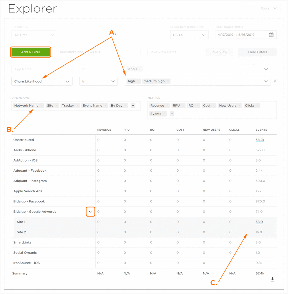
A. Add a Churn Likelihood filter.
B. Add the Churn Likelihood Dimension and remove other Dimensions except for Network Name.
C. Churn Likelihood Data.
Exporting the Explorer Data
The data displayed within the Explorer chart can be exported in CSV format.