AIM (Always-On Incremental Measurement) MMM is a real-time marketing mix modeling platform that maximizes ad spend efficiency and incrementality. AIM MMM is a sophisticated learning system that continuously updates and enriches data, ensuring that budget recommendations are always accurate and ready to use.
Available Metrics:
- Ad Spend
- Paid 365D Revenue
- CPA, ROAS
- CPI, Installs
- First Time Conversion 7 Day
- 365 Day Revenue
- Total Cost Per Acquisition 7D
- Total Return on Ad Spend (365D)
- Break Even
- Payments 7 Day
- Revenue 7 Day
- Paid Installs
- Paid First Time Conversions 7 Days
- Paid Revenue 7 Day
- Total Cost per Install
- Install to FTC Conversion Rate
- Paid Registrations and 7 Day Registrations
Dashboard Panels
The AIM MMM Dashboard is organized into three tabs: Performance Overview, Recommendations, and Media Partners. Each tab provides a distinct view of your marketing data.
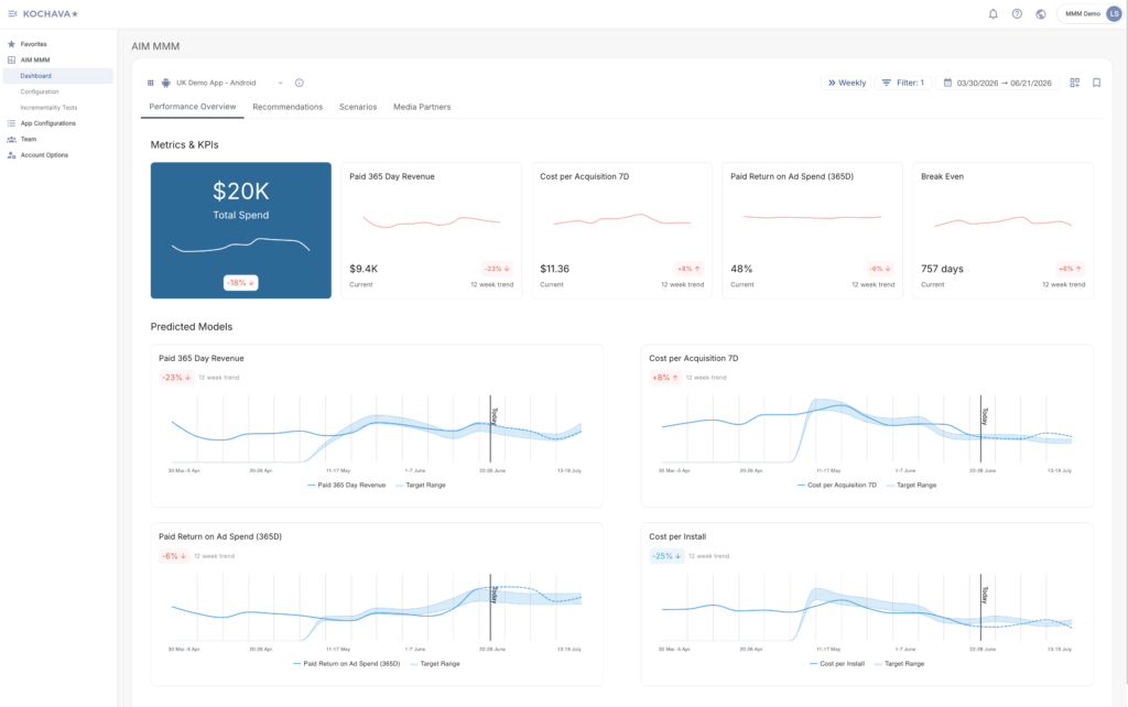
Performance Overview Tab
The Performance Overview tab is the default view upon loading the dashboard. It is divided into two sections:
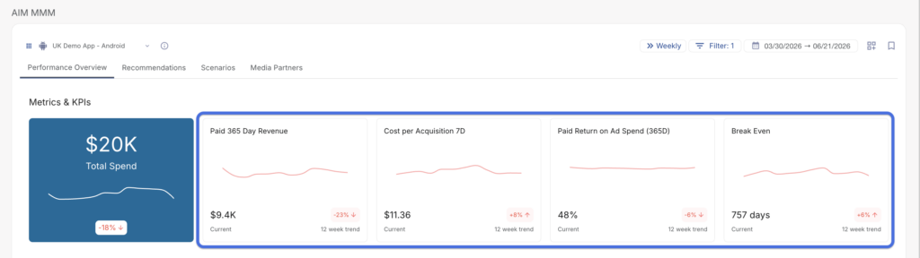
Metrics & KPIs
Total Spend (Fixed Card): A pinned card that always displays your total spend for the selected period, along with a sparkline trend chart and a percentage change badge (e.g., -18%).
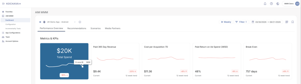
KPI Cards: Each additional card displays a named KPI (e.g., Paid 365 Day Revenue, Cost per Acquisition 7D, Paid Return on Ad Spend 365D, Break Even), along with:
- A sparkline trend chart
- The current value for the selected period
- A 12-week trend badge indicating percentage change (color-coded red or green)
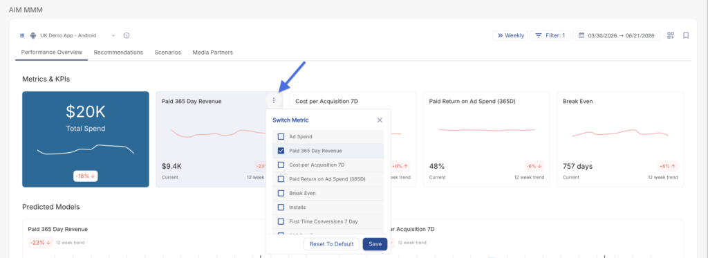
Switching Metrics on a KPI Card
Each KPI card includes a ⋮ menu (three-dot icon) in the card header. Clicking the ⋮ menu opens a Switch Metric panel, which allows you to change the metric displayed on that card.
To switch a metric:
- Locate the KPI card you want to change in the Metrics & KPIs row.
- Click the ⋮ (three-dot) icon in the top-right corner of the card.
- The Switch Metric panel opens, displaying a checklist of all available metrics.
- Check the checkbox next to the metric you want to display on the card. The currently active metric will already be checked.
- Click Save to apply your changes, or Reset to Default to restore the card’s original metric.
Predicted Models
The Predicted Models section is located directly below the Metrics & KPIs row on the Performance Overview tab. It provides a detailed, full-width chart for each of your configured KPI metrics, combining both historical performance data and forward-looking model predictions in a single view.
Each chart in the Predicted Models section represents a direct expansion of its corresponding KPI card above — they share the same metrics and the same 12-week trend badge, giving users a consistent view from summary card down to detailed chart.
What Each Chart Displays
Each chart contains multiple data series rendered as smooth spline lines and a shaded confidence band:
- Metric Line — A continuous line representing the actual observed values of the metric over the selected date range (e.g., Paid 365 Day Revenue, Cost per Acquisition 7D).
- Predicted Line — A continuation of the metric line that extends into the future based on the MMM model’s projections. This allows you to visualize where performance is expected to go based on current trends and model inputs.
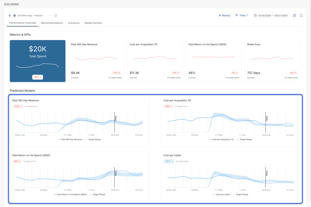
- Target Range (Shaded Band) — A shaded area displayed around the predicted line, representing the MMM model’s confidence interval or target range for the metric. The width of this band visually indicates the degree of uncertainty or acceptable variance in the prediction.
- Today Marker — A vertical plot line labeled “Today” that divides the chart between historical (observed) data on the left and model-predicted data on the right. This makes it immediately clear where real data ends and projections begin.
Recommendations Tab
The Recommendations tab provides actionable, model-driven budget allocation recommendations based on the AIM MMM learning system. This tab helps you identify where to shift spend across media partners to improve overall performance against your configured KPIs.
The tab consists of four primary components:
- Spend Recommendations & Outcome Forecast (Table)
- Cost Curves (Chart)
- Budget Recommendations Trajectory (Chart)
- Source Budget Recommendations vs. BAU Comparison (Chart)
Table Controls
Located at the top of the Recommendations tab, the table control bar includes two tools for scoping the data displayed.
Show BAU Toggle
A toggle switch labeled Show BAU is located in the upper-right control area of the table header. When enabled, the table displays both the Business as Usual (BAU) predicted values and the Recommended values side by side for each metric column, allowing direct comparison between your current trajectory and AIM MMM’s optimized recommendations. When disabled, only the Recommended values are shown.
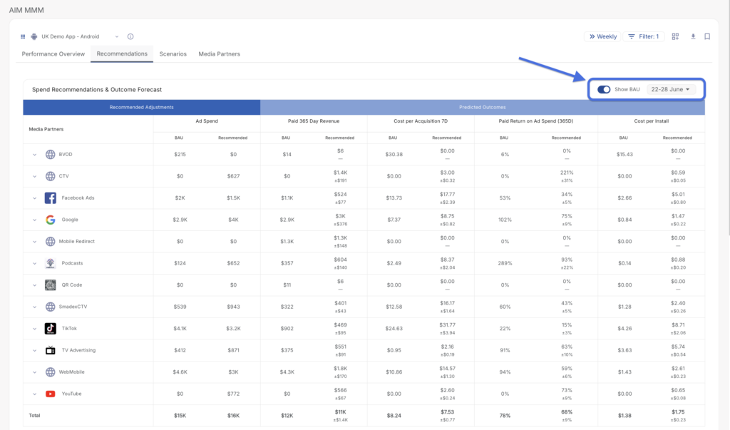
Date Selector
A date range button (e.g., 18–24 May) is located in the upper-right area of the table header. Clicking this button opens a date picker that allows you to select the specific week or time period for which you want to view recommendations.
Spend Recommendations & Outcome Forecast Table
The Spend Recommendations & Outcome Forecast table is the primary data view on the Recommendations tab. It presents a side-by-side breakdown of BAU predicted values versus AIM MMM’s recommended values for each media partner across all configured KPI metrics.
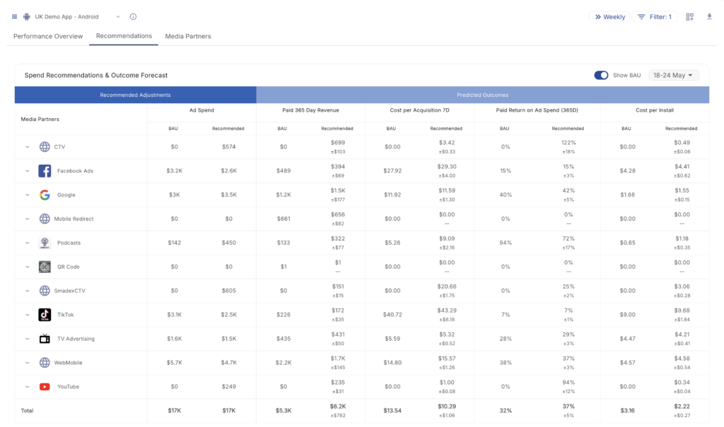
Table Structure
The table is divided into two column groups:
- Recommended Adjustments — Contains the Ad Spend column, displaying the BAU spend and the AIM MMM recommended spend for each media partner.
- Predicted Outcomes — Contains the remaining KPI metric columns, displaying the forecasted performance impact of both BAU and recommended spend levels.
Columns
Each column displays two sub-rows of values per media partner row:
- BAU — The predicted value if current spend levels are maintained.
- Recommended — The AIM MMM optimized value based on the model’s recommendations.
The following columns are displayed by default:
| Column | Description |
|---|---|
| Media Partners | The name and icon of each media partner (e.g., Google, Facebook Ads, TikTok, TV Advertising). Partners with sub-sources can be expanded using the chevron icon to view publisher-level data. |
| Ad Spend | The BAU spend amount and the AIM MMM recommended spend amount for the selected period. |
| Paid 365 Day Revenue | The predicted 365-day revenue attributable to paid channels under BAU and recommended spend levels. |
| Cost per Acquisition 7D | The predicted cost to acquire a converting user within a 7-day window, under BAU and recommended spend. |
| Paid Return on Ad Spend (365D) | The predicted return on ad spend over a 365-day window for paid channels, under BAU and recommended spend. |
| Cost per Install | The predicted cost per install under BAU and recommended spend levels. |
Confidence Intervals (± Values)
Each Recommended value in the Predicted Outcomes columns includes a ± value displayed in gray. This value represents the model’s confidence interval for that recommendation.
- A smaller ± range indicates higher confidence in the prediction.
- A larger ± range indicates greater variability and uncertainty in the forecast.
A — (dash) in place of a ± value indicates that no confidence interval is available for that data point, typically because the media partner has no active or historical spend data to model from.
Total Row
The bottom of the table includes a Total row that aggregates the BAU and Recommended values across all media partners for each metric column, giving you a holistic view of the projected impact of following AIM MMM’s recommendations across your full media mix.
Expand / Collapse Publishers
Each media partner row includes a chevron (›) expand button on the left side of the Media Partners column. Clicking this button expands the row to reveal individual publisher-level breakdowns beneath the parent media partner, enabling more granular analysis of where within a channel the spend and outcome changes are occurring.
Interpreting Recommendations
When reading the table, the following patterns are particularly actionable:
- Recommended spend is higher than BAU, and CPA decreases — AIM MMM has identified an opportunity to scale the channel efficiently. Increasing spend is predicted to acquire users at a lower cost.
- Recommended spend is lower than BAU, while installs or FTCs remain strong — AIM MMM indicates the channel may be overspending under BAU conditions. Spend can be reduced without a significant impact on performance.
- BAU spend is $0 and Recommended spend is greater than $0 — AIM MMM is recommending the activation or re-activation of a channel that is not currently receiving budget, based on modeled incremental opportunity.
Downloading Table Data
A Download icon is available in the top-right control bar of the dashboard. Clicking this icon downloads the table data as a CSV file for use in external reporting or analysis.
Cost Curves Chart
The Cost Curves chart visualizes the modeled relationship between spend and returns for each media partner, helping you understand the efficiency of incremental spend at different investment levels.
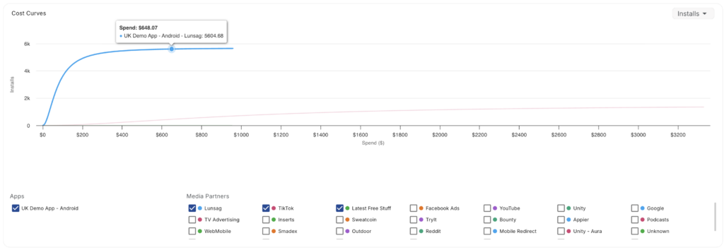
Metric Selector
A dropdown button (e.g., Installs) located in the upper-right corner of the Cost Curves card allows you to select which KPI metric is used as the Y-axis for the cost curve visualization. Changing this selection updates the chart to reflect the selected metric’s modeled response to spend across all partners.
Chart
The Cost Curves chart is rendered as a line chart. Each line represents a media partner’s modeled response curve — illustrating how the selected KPI metric changes as spend increases or decreases for that partner. Hovering over the chart displays detailed data at any given spend level.
Legend & Filtering
Below the chart, an interactive legend allows you to control which data series are visible:
- Apps — Displays a checkbox for each app. Unchecking an app removes its data from the chart.
- Media Partners — Displays a color-coded checkbox for each media partner. Toggling a media partner on or off shows or hides its cost curve on the chart, allowing for focused side-by-side comparisons.
Budget Recommendations Trajectory Chart
The Budget Recommendations Trajectory chart displays the projected trajectory of AIM MMM’s recommended spend allocations over the selected time period. This chart provides a forward-looking view of how recommended spend will evolve across your media partners, giving you a clear picture of the directional guidance being provided by the model.
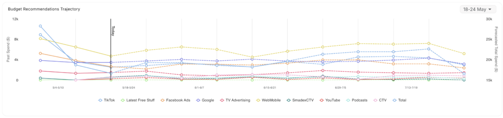
The chart is rendered as a line chart. Each media partner is represented by a distinct color-coded line. A vertical marker may indicate the boundary between historical actuals and future recommendations. Hovering over the chart displays detailed values for each partner at any point in time.
A date selector button in the upper-right corner of the card allows you to scope the chart to a specific week or time period.
Source Budget Recommendations vs. BAU Comparison Chart
The Source Budget Recommendations vs. BAU Comparison chart provides a visual side-by-side comparison of AIM MMM’s recommended spend versus the predicted BAU spend for each media partner.
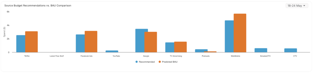
This bar chart makes it easy to identify at a glance which channels are being recommended for a spend increase versus a spend decrease relative to BAU:
- If the Recommended bar is higher than the BAU bar for a given partner, AIM MMM is recommending increased investment in that channel.
- If the Recommended bar is lower than the BAU bar, AIM MMM is recommending a reduction in spend for that channel.
Hovering over any bar in the chart displays the associated spend values. A date selector in the upper-right corner of the card allows you to scope the chart to a specific week or time period.
Media Partners Tab
The Media Partners tab provides a channel-by-channel breakdown of your media investment and its modeled performance. It is organized into two sections — Paid Media Partners and Unpaid Sources — and includes an Influences panel below the grid for deeper contribution analysis. This tab is designed to help you understand the spend efficiency and modeled return of each media channel within your marketing mix.
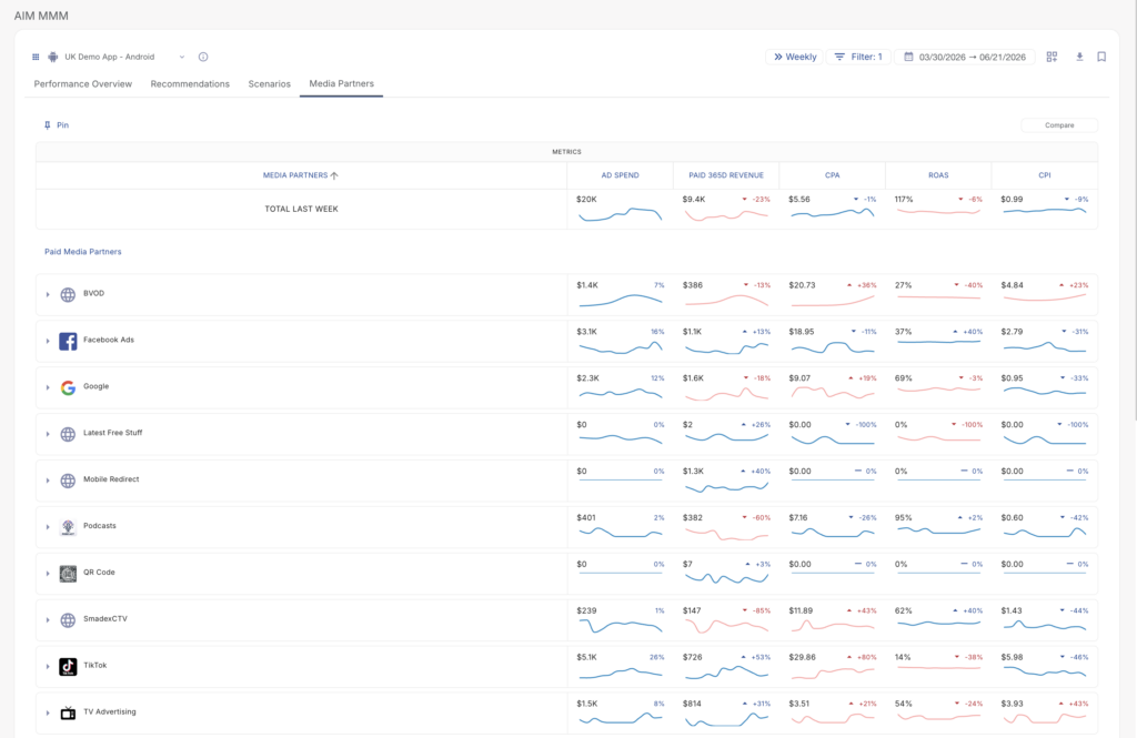
Media Partners Grid
The primary component of the Media Partners tab is a scrollable data grid. A grand total summary row at the top of the grid displays aggregated performance metrics across all partners for the most recent completed period in your selected cadence, labeled Total Last Week.
Grid Controls
A control bar above the grid provides two tools for managing the data view:
- Pin (Column Header): Clicking the Pin label in the upper-left of the grid pins the column header row to keep it visible while scrolling through a long partner list. Individual partner rows can also be pinned using the
 pin icon that appears on hover next to each partner name, keeping that partner anchored at the top of the grid for easy comparison.
 - Compare: The Compare button in the upper-right of the control bar enables a side-by-side comparison mode for selected media partners, allowing direct head-to-head evaluation across all metric columns within the same date range.
Column Headers & Sorting
All column headers in the grid are clickable for sorting:
- Click MEDIA PARTNERS to sort alphabetically (A→Z or Z→A).
- Click any metric column header (e.g., AD SPEND, ROAS, CPI) to sort all partner rows by that metric in ascending or descending order. An arrow icon next to the header label indicates the active sort direction.
- Each metric column header also includes a ⋮ (three-dot) icon. Clicking it opens a Switch Metric panel, allowing you to swap the metric displayed in that column. This works identically to the KPI card metric switcher on the Performance Overview tab.
Partner Row Components
Each row in the grid represents one media partner and contains the following elements:
- Expand Chevron (›): Click to expand a partner row and view a sub-breakdown by publisher, campaign, or sub-source — depending on available data.
- Partner Icon: A recognizable brand logo (e.g., Facebook Ads, Google, TikTok) or a generic globe icon for unrecognized sources.
- Partner Name: The media partner name as configured in your MMM data inputs.
- Pin Button (): Appears on hover next to the partner name. Click to pin the partner row to the top of the grid for persistent visibility while scrolling.
- Metric Cells: For each configured metric column, the cell displays:
- The current period value (e.g., $3.8K).
- A trend indicator showing the percentage change versus the prior period (e.g., +20% or -26%), color-coded based on whether the change is favorable or unfavorable for that metric type.
- A sparkline chart visualizing the metric’s trend over the full selected date range.
Metric Color Coding
The change indicators on each metric cell follow a metric-aware color convention:
| Color | Meaning |
|---|---|
| Blue | The directional change is favorable for a cost metric (e.g., CPA or CPI decreasing = good). |
| Red | The directional change is unfavorable (e.g., ROAS or Revenue decreasing = bad; CPA increasing = bad). |
| Gray (—) | No change period-over-period, or insufficient data to calculate a trend. |
Paid Media Partners
The Paid Media Partners section lists all paid advertising channels detected in your MMM model. Each partner row displays the configured metric columns with their current values, trends, and sparklines. A Paid Totals row at the bottom of this section aggregates values across all paid partners.
Unpaid Sources
Below the Paid Media Partners section, the Unpaid Sources section captures organic and non-paid traffic that the MMM model accounts for — such as Natural Demand (organic installs or conversions driven without paid media investment). While unpaid sources carry no Ad Spend, their revenue and conversion contribution is still modeled to properly separate baseline demand from paid media lift. An Unpaid Totals row summarizes all unpaid sources in aggregate.
Influences
The Influences panel is located below the media partner grid. It provides a deeper view of how each media channel is contributing to a selected conversion goal over time, combining a visual chart on the left with a detailed data table on the right.
Influences Chart
A stacked area or line chart on the left side of the panel visualizes each media partner’s modeled influence on the selected goal across the date range. A Network Breakdown toggle switch above the chart enables or disables the per-network split view within the visualization.
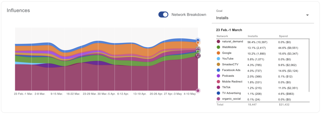
Goal Selector
A Goal dropdown on the right side of the panel allows you to choose the conversion goal driving the influence analysis (e.g., Installs). Options are pulled from the events configured in your MMM model. Changing the goal updates both the chart and the data table.
Influences Data Table
The data table on the right side of the Influences panel provides a tabular breakdown of each partner’s contribution to the selected goal for a specific week. A date label above the table (e.g., 23 Feb.–1 March) identifies the period being shown. The table includes the following columns:
| Column | Description |
|---|---|
| Network | The media partner name with a color indicator matching its corresponding series in the Influences chart. |
| [Goal] % | The percentage of total attributed goal volume for this partner, along with the raw count in parentheses (e.g., 13.1% (2,417) Installs). |
| Spend % | The percentage of total spend this partner represents, along with the raw dollar amount in parentheses (e.g., 44.6% ($9,551)). |
A Total row at the bottom of the table aggregates the raw goal count and total spend across all listed partners.