The Analytics Retention page provides a visualization of the retention of Installs, RPU (Revenue Per User), Revenue, and events for a selected time frame.
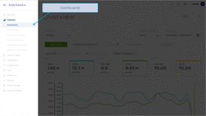
Analytics User Interface
- Log in to Kochava.
- Select the desired Account and App.
- Select Analytics > Dashboard > Retention.
Analytics Page Tools
For more information about the tools that can be used on the Analytics page such as date range, filters, sharing the page and exporting device ID, refer to our Analytics Page Tools support documentation.
Date Range:
The date range filter provides the option to refine the window of data that is displayed. The following range types and time ranges are available for selection:
- Last:
- last day
- last week
- last month
- last quarter
- last year
- Previous:
- previous calendar week
- precious calendar month
- previous calendar year
- Custom:
- Start (Inclusive):
- Relative Date/Time — This option provides a text field in which a number can be manually entered and a drop-down box where the following options:
- Days Before
- Seconds Before
- Minutes Before
- Hours Before
- Weeks Before
- Months Before
- Quarters Before
- Years Before
- Specific Date/Time — A manual date/time may be entered or the calendar and time selection tool may be used.
- Now — This is the selection of the current date and time.
- Midnight — This is the selection of the current date and the time selection of midnight or (24:00hrs).
- Relative Date/Time — This option provides a text field in which a number can be manually entered and a drop-down box where the following options:
- End (Exclusive):
- Specific Date/Time — A manual date/time may be entered or the calendar and time selection tool may be used.
- Relative Date/Time — This option provides a text field in which a number can be manually entered and a drop-down box where the following options:
- Days After
- Seconds After
- Minutes After
- Hours After
- Weeks After
- Months After
- Quarters After
- Years After
- Now — This is the selection of the current date and time.
- Midnight — This is the selection of the current date and the time selection of midnight or (24:00hrs).
- Start (Inclusive):
- Advanced:
- Start (Inclusive) — Manually enter today or a specific desired start date.
- End (Exclusive) — Manually enter today or a specific desired end date.
- Previous:
- previous calendar week
- previous calendar month
- previous calendar year
- No filter:
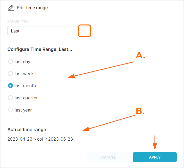
A. After range selection, select the desired time range.
B. Time range that will be displayed.
Filters:
Filters can be used to further refine, organize and visualize the displayed data in a method that is most beneficial. Multiple filters can be added and saved for later use.
- Click + Add Filter.
Added filters may be inclusive or exclusive. Select from the following filters categories:- App — Based on the available apps within account.
- Events — Based on Standard or Custom events.
- Location — Based on IP address.
- Attribution — Based on attributed installs and campaign attribution settings.
- Campaign — Based on campaign naming conventions.
- Device — Based on user agent.
- Traffic Verification — Based on Traffic success or failure.
- Agency — Based on the available apps within the agency account.
Once the filter category has been selected, one or more values may be added per filter. Filters can be saved and reapplied within any of the Analytics pages.
- Select the Filter drop-down menu, Select desired Filter.
- Add desired values.
- Click “X” to remove Filter.
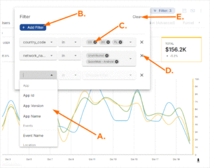
A. Filters
B. Click “+ Add Filter” to add metric
C. Click “X” to remove metric
D. Click “X” to remove Filter and associated Metric(s)
E. Click “Clear” to remove all Filters.
Cohorts:
Within Kochava, Cohorts are groups of users that installed an app within a specific date range.
- From the Cohort drop-down menu, Select one of the following:
- All Time — Displays all Event and all Install data for the selected date range.
- All Installs — Displays all Installs data within cohort date range.
- Attributed Installs — Displays only Attributed Installs within cohort date range.
- Unattributed Installs — Displays on Unattributed Installs within cohort date range.
When a Cohort is selected, the Cohort date field will be presented. Data for users who fall within the Cohort during the Cohort date range will be visualized within the defined Analytics date range.
A. Cohort Date Range: This date range determines the group of users to display within the Analytics Date Range
B. Analytics Date Range: This date range determines the overall length of time displayed
C. Data displaying the selected Cohort within the Analytics Date Range
Currency:
By default cost data is displayed in US Dollars, however cost data may be displayed in a variety of other currency.
From the Currency drop-down menu select one of the following:
- AED
- AFN
- ALL
- AMD
- ANG
- AOA
- ARS
- AUD
- AWG
- AZN
- BAM
- BBD
- BDT
- BGN
- BHD
- BIF
- BMD
- BND
- BOB
- BRL
- BSD
- BTC
- BTN
- BWP
- BYN
- BYR
- BZD
- CAD
- CDF
- CHF
- CLF
- CLP
- CNH
- CNY
- COP
- CRC
- CUC
- CUP
- CVE
- CZK
- DJF
- DKK
- DOP
- DZD
- EEK
- EGP
- ERN
- ETB
- EUR
- FJD
- FKP
- GBP
- GEL
- GGP
- GHS
- GIP
- GMD
- GNF
- GTQ
- GYD
- HKD
- HNL
- HRK
- HTG
- HUF
- IDR
- ILS
- IMP
- INR
- IQD
- IRR
- ISK
- JEP
- JMD
- JOD
- JPY
- KES
- KGS
- KHR
- KMF
- KPW
- KRW
- KWD
- KYD
- KZT
- LAK
- LBP
- LKR
- LRD
- LSL
- LYD
- MAD
- MDL
- MGA
- MKD
- MMK
- MNT
- MOP
- MRU
- MVR
- MWK
- MXN
- MYR
- MZN
- NAD
- NGN
- NIO
- NOK
- NPR
- NZD
- OMR
- PAB
- PEN
- PGK
- PHP
- PKR
- PLN
- PYG
- QAR
- RON
- RSD
- RUB
- RWF
- SAR
- SBD
- SCR
- SDG
- SEK
- SGD
- SHP
- SLL
- SOS
- SRD
- SSP
- STD
- STN
- SVC
- SYP
- SZL
- THB
- TJS
- TMT
- TND
- TOP
- TRY
- TTD
- TWD
- TZS
- UAH
- UGX
- USD
- UYU
- UZS
- VES
- VND
- VUV
- WST
- XAF
- XAG
- XAU
- XCD
- XDR
- XOF
- XPD
- XPF
- XPT
- YER
- ZAR
- ZMW
- ZWL
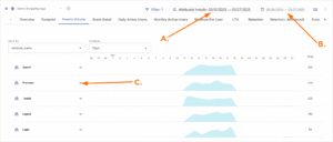
Retention Chart Overview
The Retention chart is divided into 2 main sections, the dates within the selected time interval and the graphical display of retention in either data or chart form.
Mousing over any data blocks/chart within the display will show the Date, RPU, Revenue, and Events for the specific data block or chart.
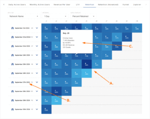
A. Graphic display of Retention data
B. Dates within timeframe
C. Mousover Data
Retention Organization
Retention data can be organized in many different ways in order to assist in the optimization of data visualization.
- From the Split By drop-down menu, Select one of the following:
- App
- Network Key
- App
- Locate the desired date and click the Data Expand Button.
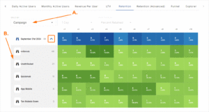
A. Retention data organized into Campaigns
B. Campaigns active during the selected timeframe
Organize by Interval
The date intervals are displayed along with the Install Count for the corresponding date along the vertical axis. Date intervals can be updated by selecting one of the following:
Interval Drop-Down Menu:
- 1 Day
- 7 Days
- 30 Days
Ten dates will be displayed in the vertical axis which correspond to the selected interval. The earliest date within the selected timeframe is displayed at the top of the list and the final date within the timeframe is displayed at the bottom of the list.
The date interval is also represented along the horizontal axis at the top of the graphical display section corresponding to the selected interval (i.e., 1, 7 or 30).
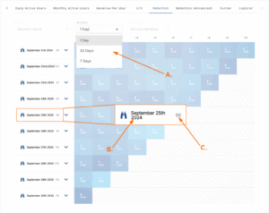
A. Interval from 1 Day to 30 Days
B. Date within the selected time interval
C. Install Count for day
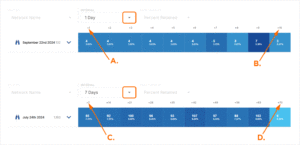
A. Date + 1 = Mar 28th
B. Date + 10 = Apr 6th
C. Date +7 = Feb 3rd
D. Date +70 = Apr 6th
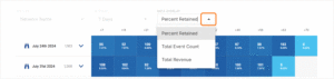
Data Overlay
The data that is shown within the graphic display may be updated to illustrate the different aspects of the retention within the app. The data displayed may be updated by selecting one of the following:
Data Overlay Drop-Down Menu:
- Percent Retained
- Total Event Count
- Total Revenue
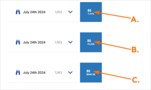
A. Percent Retained
B. Total Event Count Overlay: Install count and Events for day
C. Total Revenue Overlay: Install count and Revenue for day
FAQ
Why is there sometimes over 100% retention?
The data in the retention analytics view is based on summary numbers to allow for reasonable render time and therefore have a statistical accuracy margin of 3-5%.
Why is the Date Range greyed out?
The retention views use Cohort Dates instead of the standard date range.