The following document outlines the Analytics UI (User Interface) which graphically displays app stats and campaign performance metrics. Each section of the Analytics UI is briefly described in this document.
Data Displayed in the Analytics Dashboard:
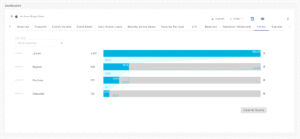
- Overview — A high level aggregate display of users, events and revenue for an app. New Installs are also visualized by Network, Device Type and Device Version.
- Analytics Performance — Provides the option of selecting from designated Analytics views or the ability to select from the available fields and create a custom view of the data that is most important to you.
- Footprint — World map displaying the install history for an app.
- Event Volume — A visual representation of event volume for an app, for all integrated post-install events.
- Event Detail — A visual representation of specific event totals.
- Daily Active Users — A display of daily unique users for an app, with overlays of revenue and purchase events on top of daily average users.
- Monthly Active Users — A visualization of the monthly unique users for an app with overlays of revenue and purchase events on top of monthly average users.
- Revenue Per User — A display of the average revenue generated by each user for a selected time frame.
- Facebook Insights — A visualization of the Facebook ad and measurement data associated with a specific app.
- SKAdNetwork Insights — A visualization of the SKAdNetwork ad and measurement data associated with a specific account or desired app(s).
- LTV (Lifetime Value) — A visual representation of the revenue generated by users for a defined cohort over a 1, 7, 14 and 30 day time frame.
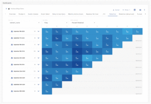
- Retention — A visual overlay of user retention rates by day for the app, with overlays of total revenue, revenue per user, and aggregate events.
- Retention (Advanced) — A visualization of the retention of Installs, RPU (Revenue Per User), Revenue, and events for a selected time frame. Retention (Advanced) provides quick access to organize Retention intervals by cohorts and custom milestones.
- Funnel — A visualization of the user paths within an app based on an advertiser’s input/definition.
- Explorer — The Explorer page provides unprecedented access to data, allowing custom report creation with few limitations on data dimensions or metrics. The Explorer page provides the clearest and most in-depth way to view app data.
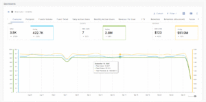
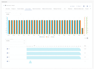
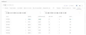
Analytics Overview
Users, Event Volume and Revenue:
A graphic representation of Users, Event Volume and Revenue. Filters can be added to further focus on specific areas such as Attribution, Campaigns, Device Versions, Location or Events.
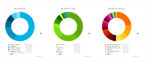
New Installs:
A graphic display of New Installs filtered by Network, Device Type, Device Version and OS Version. Mousing over any section of a donut chart will display the details for that section.
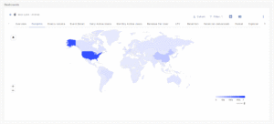
Footprint Overview
The Footprint view is a representation of an app’s history on a world map. Hovering over a country quickly displays data such as Total Users, Events, Sessions, Revenue per Install, Geo Country, Revenue, Active Users, Events per Users, New Users, Session Events and Revenue Per User.
By clicking on a specific country, the UI will zoom in and focus on that country allowing close examination of the country-specific data and any surrounding countries.
Filters can be added to further focus on specific areas such as Attribution, Campaigns, Device Versions, Location or Events.
Events Volume Overview
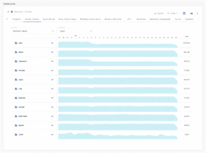
The Events Volume view displays the event totals for the selected app within the chosen time frame.
Mousing over any of the events will display the data for that event.
The displayed data can be split by Campaign, Device, Events, Location and Attribution.
A drop-down menu is provided to filter the displayed data to days, weeks or months within the defined date range.
Filters can be added to further focus on specific areas such as Attribution Source, Campaign, Device Version, Location or Events.
Event Detail Overview
The Event Detail view displays the event count, revenue and the number of users associated with specific events within the chosen time frame.
Mousing over any of the days will display the data for the selected event.
The displayed data can be split by Campaign, Device, Events, Location and Attribution.
Filters can be added to further focus on specific areas such as Attribution Source, Campaign, Device Version, Location or Events.
Daily Active Users Overview
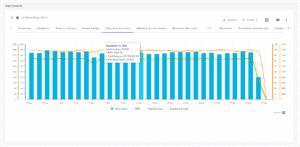
The Daily Active Users view displays the total Active Users, Purchase Events, Total Revenue and RPU (Revenue Per User) on a per-day basis.
Mousing over any of the dates within the selected time frame will display details of the selected metrics. A zoomed-in date range may be examined by clicking on the first date in the range and dragging to the last date desired in the range.
Filters can be added to further focus on specific areas such as Attribution Source, Campaign, Device Version, Location or Events.
Monthly Active Users Overview
The Monthly Active Users view displays the total Active Users, Purchase Events, Total Revenue and RPU (Revenue Per User) on a per month basis.
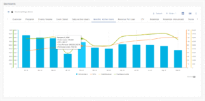
Mousing over any of the dates within the selected time frame will display details of the selected metrics.
Filters can be added to further focus on specific areas such as Attribution Source, Campaign, Device Version, Location or Events.
Revenue Per User Overview
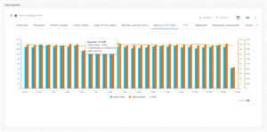
The Revenue Per User view displays on a by-day basis, the total Active Users, Revenue and RPU (Revenue Per User).
Mousing over any of the dates within the selected time frame will display details of the selected metrics.
Filters can be added to further focus on specific areas such as Attribution Source, Campaign, Device Version, Location or Events.
Lifetime Value Overview
The LTV (Lifetime Value) view displays the value of selected groups within a given time frame.
Filters can be added to further focus on specific areas such as Campaign, Device, Events, Location or Attribution.
A drop-down menu is provided to filter the displayed data by 24 hours, 7 days, 14 days and 30 days. By default 7 days is displayed.
Retention Overview
The Retention view displays the user retention rates by day for the app, with overlays of Total Revenue, Revenue Per User and Aggregate Events. Data can also be displayed in Data or Chart format.
Overlays can be added to the graph displaying the Total Revenue and/or Total Event Count for each specific day within the selected time frame.
Filters can be added to further focus on specific areas such as Attribution Source, Campaign, Device Version, Location or Events.
Retention (Advanced) Overview
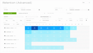
The Analytics Retention (Advanced) page provides a visualization of the retention of Installs, RPU (Revenue Per User), Revenue, and events for a selected time frame. Retention (Advanced) provides quick access to organize Retention intervals by cohorts and custom milestones. Data within Retention can also be calculated utilizing the Classic or Range approaches providing data calculations to answer any question that may exist.
Funnel Overview
The Funnel view displays how users interact with an app based on a defined set of events which are being tracked by Kochava.
Events can be selected from a drop-down list enabling any number of “user paths” through the app to be viewed and analyzed. Percentages are displayed illustrating the user retention and user dropoff between events.
Explorer Overview
The Explorer view provides the ability to drill down into the data associated with an app. Dimensions and Metrics may be added or removed to view data in any combination providing unprecedented access to analyze the data associated with an app.
Clicking on Dimensions will expand those Dimensions, displaying the specific data associated. Dimensions and Metrics may be reordered to display data as needed.
Filters can be added to further focus on specific areas such as Attribution Source, Campaign, Device Version, Location or Events.
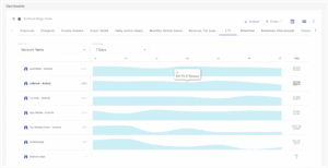
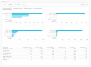
Performance
The Performance view provides the ability to quickly and easily view the performance of networks, campaigns, creatives and countries.
Mousing over the graphs will display the corresponding data.
The Spreadsheet display provides an in-depth view of the data associated with the selected view.
Facebook Insights
The Facebook Insights view displays Facebook ad and measurement data for a specific app. The Field Control section provides robust features allowing users to easily locate, select or remove fields for analysis.
The Graphic Display section provides a multitude of way to visually display the data associated with the selected fields.
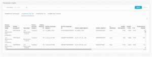
The Spreadsheet display provides an in-depth view of the data associated with the selected quick view or custom view.
SKAdNetwork Insights
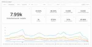
The SKAdNetwork Insights view displays SKAdNetwork ad and measurement data for an account or specific app(s). The Field Control section provides robust features allowing users to easily locate, select or remove fields for analysis.
Filters can be easily added, removed and updated to provide a variety of graphical views and quickly focus in on a specific subset of data.
The SKAdNetwork page provides nine data tiles which update as filters are applied or removed.
The page also provides an interactive chart which allows for the examination of the metrics listed within the data tiles over the selected timeframe. The chart is color coded and the metrics can be easily toggled on or off.
Funnels may be saved as views and reapplied at a later date.
Filters can be added to further focus on specific areas such as Attribution Source, Campaign, Device Version, Location or Events.